I must confess, I've become disillusioned with my newest obsession,
blog designing! Now I've never really designed anyone's blog per se (just a few tips and tweaks for other friends), but I think I'm kind of fancying the blog design bandwagon! So today, I'll let you download a super-easy tutorial on how you can design your own blog (on Blogger, works for Wordpress too) and I'll give you all the blog design elements I designed in this tutorial for
free!
Seatbelt on girls!
I'm honestly head over heels for this one, so much that I feel like switching like my own blog design to the one in this tut, but I'm still in the process of primping up my own. ;)
I used Photoshop CS6 for this tutorial (the version doesn't really matter though) but if you're good at other online editing apps like picmonkey and pixlr then you can probably use those too. Isn't is nice when everything is so versatile?
The blog elements include the header, the fonts, social media icons and the navigation tabs. The above is a screenshot for you to see how they all look like after put together. Such a happy family!
The zip file I put for download include the pdf file which lists the detailed tutorial as well as the individual design elements to upload onto a basic blog template.
Header:
Every blog needs a
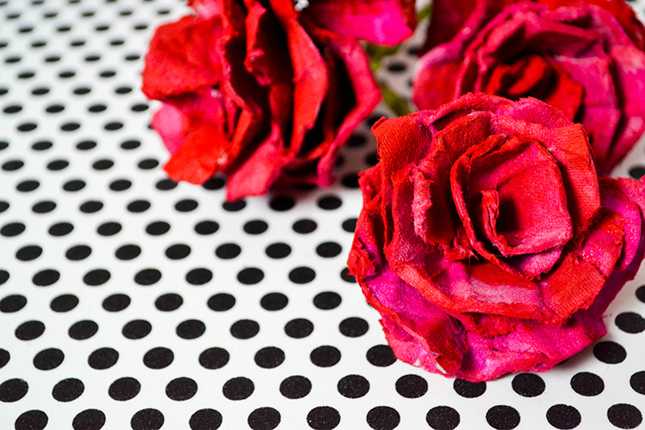
whopper of a header. It's the first thing that makes those eyeballs stay put on your blog or else close the window pronto! Here's how I made mine and you can make yours too. Begin by thinking of a theme. I love fresh. pretty colors and it's Spring too, so I grabbed
this image from Pinterest for reference and began painting away.
Hand-drawn doodles or painted designs are so much the chic trend now and they really give that casual+professional feel to a blog. Here are the steps:
We now import the image in photoshop (it can be a scanned file from your printer or a photograph you took, I used the photograph) and continue with the editing to create our pretty blog banner.
You can see the rest of the steps in the pdf file because the post will run incredibly large if I do post everything over here. (Yes, Nash you say, please don't force us to read your long drawl-y posts!)
A nice way to give your blog a super-polished look is to choose colors with a contrast. Use a few colors from one part of the spectrum and then choose a few colors from a contrasting range of the spectrum. Like, me being me, used a rage of hot pink to pale pink petals to add a feminine pop of color in the header, and a lot of gender neutral blues and greens to give a beautiful contrast. Of course, if you like, you can still make it all your favorite color, but I just think having a palette adds so much more visual interest!
The best part? You don't even need to be a good painter. Posing as one will do (I do the same!)
Fonts:
Fonts make up so much of the blog's readability. Fonts look great paired with contrasts too (Sans serif with serif. Plain fonts with calligraphic. Serious fonts with playful, handwritten ones). Whenever you'd like to use a fancy font, make sure you use it where you need a large font size. Generally, fancy fonts are difficult to read when they are small-sized. Stick to the very basic of fonts for large chunks of writing, because they are more readable and pleasant.
See all the font-mantra I just mentioned down below. The blog title has been written in a calligraphic font (I list the fonts names in the downloadable tutorial file). The tagline for the blog is written in a simplistic font. It helps the fancy calligraphic font pop even more!
Textures and Patterns:
While you can use a multiple of patterns and textures, make sure that you either
1) Use a focal design on one area of the blog and keep the rest minimal or
2) Use a variation of textures on different areas while making sure they all tie up perfectly well together (Usually making everything look unified goes back to the colors you used.)
Obviously the second choice is more difficult to follow through. For this blog design I kept the background completely plain but you can use a very minimal background too and it would still look great.
My
rule of the thumb for the
perfect laid back+professional design is this, pair opposites but not to the extremes. For ex, I paired delicate flowers with some geometry(circles)! They are not really opposites but circles usually don't come anywhere near flowers, do they? :)
Social Media Icons and Navigation Tabs:
Since I used the same colors and geometry for the navigation tabs as the header (again to tie everything together), I used an ombre pink for the social media icons.
You can check out how to:
1. Upload a header images to blogger
2.Upload social media icons for blogger
3.Upload navigation tabs in blogger:
To upload navigation tabs, use the same technique as the social media icons but don't upload all the images into one widget but individual widgets and link each to it's url.
Everything includes psd files so they're editable or you can add extras by modifying the existing elements. :)
You can download the whole step-by-step tutorial here.
You can download the whole zip file for the design elements here.
Have any questions? Drop a comment! Or leave a comment on my Pinterest/Instagram/Facebook!
................................
Meanwhile, pin this and share it if you found this useful. *smile*
Check other
design resources here
Lots and lots and lots and lots of hugs,
Nash, xoxo
(And oh yes, check how how the blog design looks over
here!)


